
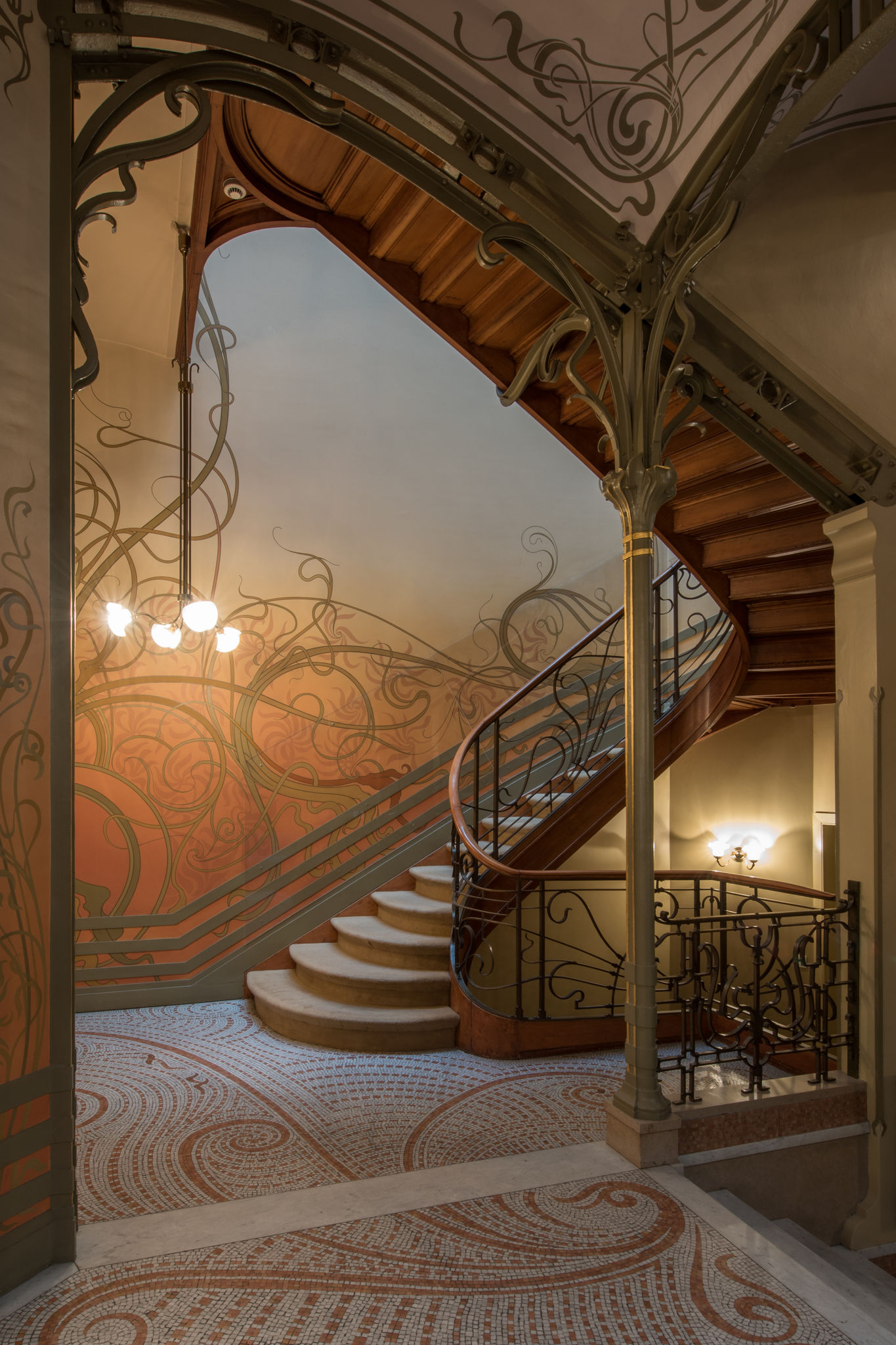
Before either of us drew a single case, Max and I spent a weekend photographing Brussels — Horta's Hôtel Tassel and Hôtel van Eetvelde, the ironwork of the Old England building, Guimard's métro entrances. No brief, no client, just a shared folder of facades, stairwells and balconies that kept pulling us back. That folder became the starting point for everything Kobus has designed since.
The obvious reference for a new design-led watch brand is Art Deco — symmetrical, geometric, already the visual shorthand a dozen luxury brands reach for. Art Nouveau is harder: asymmetric, organic, built from structure rather than applied decoration. Harder to translate onto something as small as a case and dial. We chose it anyway, because that difficulty was the point — it gave Kobus a point of view instead of a place in an already crowded aesthetic.
What came out of that weekend was less a mood board than a set of questions we now ask of every part: does this curve carry weight, or just decorate. Every decision since — the case shape, the dial layout, the details still being finalised — gets tested against that same standard.